Digital design is more than just picking the right colors and fonts. It is about using precise calculations to create balance and harmony. Artists have used these ideas for hundreds of years to make things aesthetically pleasing. Today, online architects often use these same golden proportions to make layouts look good and feel just right. This not only makes virtual platforms easier to use, but also fosters an enjoyable experience. https://webdesignernews.com/the-invisible-art-of-web-symmetry/
Melden Sie sich an, um einen Kommentar hinzuzufügen
Andere Beiträge in dieser Gruppe


In this article we’ll look at 12 things you can do on your website to make it load faster. But first, let’s take a look at what website performance is all about and how it’s measured

In a previous blog post, we explored how AI Assistant in Adobe Experience Platform is monitored and improved via an end-to-end evaluation framework, including how we track, categorize, and learn from
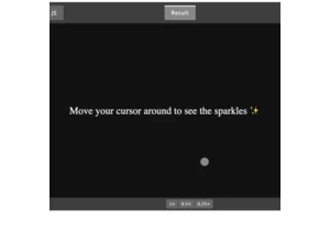
A magical sparkle cursor is a simple way to draw attention and make any website memorable. In this tutorial, we’ll build a beautiful sparkle cursor from scratch using HTML, CSS, and JavaScript. https:
What seemed like a straightforward request—add a horizontal scroll bar to the Layers panel in Figma—presented unexpected challenges. Here’s how the design and engineering teams iterated and prototyped

Product design isn’t just about making things pretty. It’s about making them work well for real people. It’s about identifying problems, ideating solutions, and packaging it in something that’s not ju

Over the years, I’ve taken and adapted this work as part of a range of projects with different organisations. This has also meant that I’ve built on the work of others – some notable early examples of