


Turns out you can use several different libraries to pass color information around components. Or, you could use custom properties, built right into CSS, have no decline in your own developer experience, and deliver a faster experience to your users. …
The post Use CSS Variables instead of React Context appeared first on CSS-Tricks. You can support CSS-Tricks by being an MVP Supporter.

Blobs are the smooth, random, jelly-like shapes that have a whimsical quality and are just plain fun. They can be used as illustration elements and background effects on the web. So, how are they made? Just crack open an illustration …
The post Three Ways to Blob with CSS and SVG appeared first on CSS-Tricks. You can support CSS-Tricks by being an MVP Supporter.

I’ve been a manager for many years at companies of different scale. Through these experiences, I’ve done my share of learning, and made some mistakes along that way that were important lessons for me. I want to share those with …
The post Mistakes I’ve Made as an Engineering Manager appeared first on CSS-Tricks. You can support CSS-Tricks by being an MVP Supporter.
https://css-tricks.com/mistakes-ive-made-as-an-engineering-manager/

Simeon Griggs with some nice UX ideas for a recipe website:
No math. Swap between units and adjust servings on-the-fly. Offer alternative ingredients. Re-list the ingredient amounts when they’re referenced in the instructions.
I totally agree, especially on that last …
The post Recipe websites, data modeling, and user experience appeared first on CSS-Tricks. You can support CSS-Tricks by being an MVP Supporter.
https://www.simeongriggs.dev/designing-a-more-complete-recipe-website

Zach takes a look at some fundamental HTML+CSS usage for fluid, responsive images. Most of it, I’d say, is what you’d expect, but things get weird when srcset gets involved. I poked my way through, and in addition to the …
The post Barebones CSS for Fluid Images appeared first on CSS-Tricks. You can support CSS-Tricks by being an MVP Supporter.
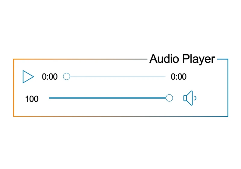
HTML has a built-in native audio player interface that we get simply using the element. Point it to a sound file and that’s all there is to it. We even get to specify multiple files for better browser support, …
The post Let’s Create a Custom Audio Player appeared first on CSS-Tricks. You can support CSS-Tricks by being an MVP Supporter.

I’ve been enjoying these little “You want…” style posts. Post titles like that are a little more… forceful for my normal taste, but I like the spirit of sharing a best practice that perhaps isn’t well-known-enough.
Killian started it with
…
The post You want… appeared first on CSS-Tricks. You can support CSS-Tricks by being an MVP Supporter.
Some nice coverage from Andy about CSS things that are truly new. If you haven’t looked at new things in CSS in, say, a year, I’d bet pretty much all of this will be new to you. A lot of …
The post Things You Can Do With CSS Today appeared first on CSS-Tricks. You can support CSS-Tricks by being an MVP Supporter.
https://www.smashingmagazine.com/2021/02/things-you-can-do-with-css-today/
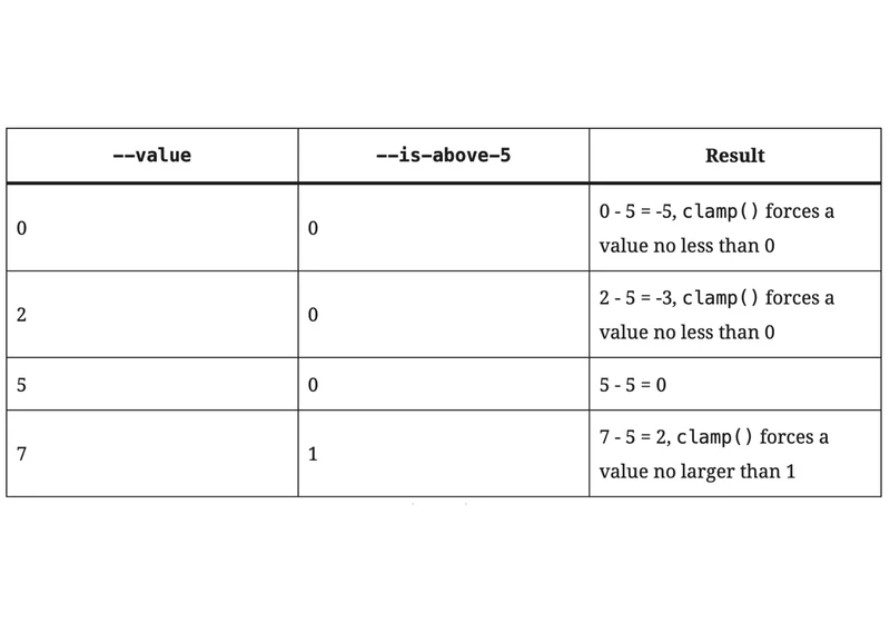
CSS is yet to have a switch rule or conditional if, aside from the specific nature of @media queries and some deep trickery with CSS custom properties. Let’s have a look at why it would be useful if we …
The post CSS Switch-Case Conditions appeared first on CSS-Tricks. You can support CSS-Tricks by being an MVP Supporter.

I like Andy’s idea here: .wrapper { width: clamp(16rem, 90vw, 70rem); margin-left: auto; margin-right: auto; padding-left: 1.5rem; padding-right: 1.5rem; } Normally I’d just set a max-width there, but as Andy says:
This becomes a slight issue in mid-sized viewports, such
…
The post Use CSS Clamp to create a more flexible wrapper utility appeared first on CSS-Tricks. You can support CSS-Tricks by being an MVP Supporter.