I’ve tried virtually every major messenger app over the years, but my favorite has always been Apple’s Messages. No, I’m not a blue bubble snob. I’ll happily use different messaging apps with different friends. But I’ve always preferred Apple’s Messages because of its clean, minimalist design. Still, many of my friends prefer WhatsApp, and most businesses that offer messenger-based support use it, so I also use Meta’s messenger quite frequently. That being said, WhatsApp for Android has always bugged me because its UI has always seemed too crowded.
The green top header that took up nearly a fifth of the app’s real estate felt wasteful, like an unneeded ceiling. And the text-based tabs for chats, updates, and calls preceded by a camera icon made it feel like Meta was just cramming in buttons willy-nilly. Then there’s the fact that a search field was never displayed—only a magnifying glass icon—so it was easy to forget that you could search in WhatsApp.
But all that changed last week, when WhatsApp rolled out its first major redesign in three years. I love the Android redesign so much, and for one big reason: WhatsApp now looks a lot like Apple’s Messages.
we’re rolling out design updates to give WhatsApp a fresh new look, while keeping it familiar + easy to use 🤩 here are some ways it’s changing ⬇️
— WhatsApp (@WhatsApp) May 9, 2024
• updated layout and icons that that help you find what you need faster
• new illustrations with added animation to… pic.twitter.com/pFu0cfxpWY
Gone is the big green clunky header hovering over Android users’ chat threads. Now there’s a slimmer space with an all-white background, making the app feel light and airy—just like Apple’s Messages. And just like Apple’s Messages, WhatsApp for Android now keeps the search bar displayed just above your chat threads, making accessing the function easy.
I would actually go so far as to argue that the redesign makes WhatsApp even more appealing now than Apple’s Messages. Why? Because the new WhatsApp design doesn’t go all-in on minimalism like Apple’s Messages, putting design over function. WhatsApp has always been able to do more than Apple’s Messages—for example, it has features such as archiving and Communities—so by its very nature, WhatsApp has always required a more crowded interface. But in the redesign, WhatsApp didn’t sacrifice usability for sleekness.
As a matter of fact, WhatsApp now uses screen space better than Apple’s Messages does. Even with its more minimalistic new design, it offers users a new way to quickly see all their unread or group messages at the tap of an unobtrusive button, just above the most recent chat—something not possible in Apple’s Messages. It also has a handy toolbar at the bottom of the app that allows you to quickly toggle between your calls, chats, communities, and more.
For Android users especially, it’s a coup. With the redesigned WhatsApp, Meta has finally given users the iMessage app they’ve always wanted. It’s got the design appeal of Apple Messages, with the functionality WhatsApp has always had, and platform cross-compatibility to boot.
Another thing that struck me about the WhatsApp redesign is that Meta seems to be embracing WhatsApp’s green color scheme more than ever. The company tested more than 35 different shades of green before settling on the bright one now featured in the redesign. Some people don’t like the color change, but I think it looks great, and on iOS, the green elements of the new WhatsApp are a nice contrast to the blue of the prior WhatsApp for iPhone design.
Hell, maybe Meta is even trying to make green the “cool” messenger color now. Blue chat bubbles might have all the cultural cachet, but now when users open up their messenger app and see those green interface elements, they’ll immediately know that no one is excluded from their group chats simply because they use one platform instead of another.
Of course, I still prefer Apple’s Messages, but that’s because the company continues to offer more robust security and privacy protections than WhatsApp. For example, earlier this year, Apple began rolling out post-quantum cryptography to Messages, which makes the end-to-end encryption protecting your chats today future-proof against decryption by quantum computers in the years ahead. WhatsApp still only offers classical encryption.
Plus, unless you agree to give WhatsApp access to your contacts, the app will still refuse to show you the names of the people you are chatting with—it will only show their phone numbers. But there is no reason for this requirement, since every WhatsApp user can set their own username, which WhatsApp could easily display for you.
Still, from a design perspective at least, WhatsApp has made great improvements with its visual shakeup, especially on Android.
Login to add comment
Other posts in this group

If real Easter eggs aren’t your thing this weekend, you may find hunting for digital ones more enjoyable. And there are some cool ones to find at your fingertips, provided you have an iPhone or Ma
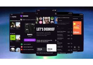
With music streaming, users have gotten used to being at the mercy of algorithms. But French music streamer Deezer is making it easier for its subscribers to make the algorithm work for them.

Trying to get from point A to point B? If only it were that simple! With any manner of travel these days, you’ve got options: planes, trains, buses, ferries, and beyond. And finding the best
When Twitter cofounder and Medium founder Evan “Ev” Williams was planning his 50th birthday party, he didn’t know who to invite. Having spent more of his life building and scaling tech

If you thought you’d heard the last of the viral “Apple” dance, think again. The TikToker behind it is now suing Roblox over its unauthorized use.
Last year, during the height of Brat su

A Wall Street Journal report this week gave an extensive look into how Elon Musk, the

Netflix fared better than analysts anticipated during the first thr