Overview: UX and UI design are two interdependent roles in creating digital products. UX focuses on the structure and functionality, while UI enhances the visual appeal and interactivity. Together, they ensure seamless and engaging user experiences. This blog covers a detailed comparison of UX vs UI. It will help you understand these two roles and guide you in deciding which type of designer to hire for your next project. https://webdesignernews.com/ux-vs-ui-picking-the-right-designer-for-your-product/
Login to add comment
Other posts in this group


In this article we’ll look at 12 things you can do on your website to make it load faster. But first, let’s take a look at what website performance is all about and how it’s measured

In a previous blog post, we explored how AI Assistant in Adobe Experience Platform is monitored and improved via an end-to-end evaluation framework, including how we track, categorize, and learn from
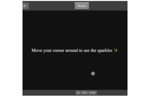
A magical sparkle cursor is a simple way to draw attention and make any website memorable. In this tutorial, we’ll build a beautiful sparkle cursor from scratch using HTML, CSS, and JavaScript. https:

What seemed like a straightforward request—add a horizontal scroll bar to the Layers panel in Figma—presented unexpected challenges. Here’s how the design and engineering teams iterated and prototyped

Product design isn’t just about making things pretty. It’s about making them work well for real people. It’s about identifying problems, ideating solutions, and packaging it in something that’s not ju

Over the years, I’ve taken and adapted this work as part of a range of projects with different organisations. This has also meant that I’ve built on the work of others – some notable early examples of