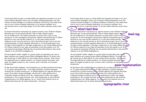
I like Andy’s idea here: .wrapper { width: clamp(16rem, 90vw, 70rem); margin-left: auto; margin-right: auto; padding-left: 1.5rem; padding-right: 1.5rem; } Normally I’d just set a max-width there, but as Andy says:
This becomes a slight issue in mid-sized viewports, such
…
The post Use CSS Clamp to create a more flexible wrapper utility appeared first on CSS-Tricks. You can support CSS-Tricks by being an MVP Supporter.
https://piccalil.li/quick-tip/use-css-clamp-to-create-a-more-flexible-wrapper-utility
Accedi per aggiungere un commento
Altri post in questo gruppo


Tips and tricks on utilizing the CSS backdrop-filter property to style user interfaces. You’ll learn how to layer backdrop filters among multiple elements, and integrate them with othe

Custom cursors with CSS are great, but we can take things to the next level with JavaScript. Using JavaScript, we can transition between cursor states, place dynamic text within the cursor, apply c

This CSS-Tricks update highlights significant progress in the Almanac, recent podcast appearances, a new CSS counters guide, and the addition of several new authors contributing valuable content.

If I were starting with CSS today for the very first time, I would first want to spend time understanding writing modes because that’s

Most of the time, people showcase Tailwind's @apply feature with one of Tailwind's single-property utilities (which changes a single CSS declaration). When showcased this way, @apply d