


Squid Game, the cultural phenomenon that took the world by storm, was more than just an intense story; it was also a stunning visual experience. In addition to its engaging plot and powerful social commentary, the show’s distinctive and mesmerizing visual style made a lasting impression on its audience. https://webdesignernews.com/minimalism-and-contrast-squid-games-visual-design-principles-for-the-web/

Logos are no longer the sole defining element of a brand, as dynamic branding, AI personalization, and social media dominance challenge their relevance. While still valuable as anchors of identity, logos must evolve into adaptable, integrated tools to thrive in today’s fluid and experience-driven branding landscape. https://webdesignernews.com/are-logos-becoming-irrelevant-in-modern-branding/
Measuring user experience (UX) has always been a complex challenge, requiring a blend of creativity and data-driven precision. To tackle this, I created the User Experience Improvement Score (UEIS), a metric that offers a comprehensive view of UX enhancements while pinpointing specific areas for growth. https://webdesignernews.com/understanding-traditional-ux-metrics/

This week’s Unicorn Club is full of fantastic resources to dive into. From creating seamless UX and understanding the proximity principle to exploring the emotional side of design and the origin of the hamburger icon, there’s plenty to get stuck into. https://webdesignernews.com/css-snippets-audibles-ux-insights/

Svelte 5 is out, and it’s radically different but intimately familiar. https://webdesignernews.com/svelte-5-and-the-future-of-frameworks/

We are getting spoiled with so many new features involving animations with CSS, from scroll-driven animations to view transitions, and plenty of things in between. But it’s not always the big features that make our everyday lives easier; sometimes, it’s those ease-of-life features that truly enhance our projects. In this article, Brecht De Ruyte puts two features on display: @starting-style and transition-behavior — two properties that are absolutely welcome additions to your everyday work with

As a website designer or website owner, you typically think you have only one way to create a website — a white background, black font, and different visual elements in the foreground. But that’s only one variant of website layout. The alternative is the dark mode. https://webdesignernews.com/the-impact-dark-mode-has-on-user-experience/
Website accessibility and SEO go hand in hand. They basically share the same goal of creating a user-friendly, easy-to-navigate website that is accessible to a wider audience. https://webdesignernews.com/why-accessibility-improves-seo/
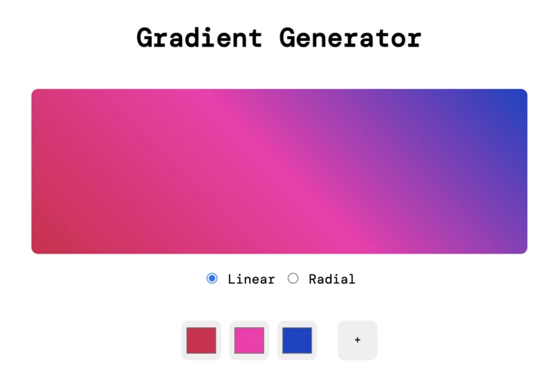
Time to make things pop! By the end of this tutorial, you’ll have your own gradient tool to generate CSS and create stunning gradients that bring a striking appeal to any web design. https://webdesignernews.com/how-to-create-a-color-gradient-tool-in-javascript/
In a time of blurred roles, new technology, and breakneck product cycles, how do we uphold craft and purpose in our work? https://webdesignernews.com/shaping-the-future-figmas-vision-for-design-collaboration/