Tooltips are a very common pattern used in CSS for years. There are a lot of ways to approach tooltips in CSS, though some evoke headaches with all the magic numbers they require. In this article, Temani Afif presents modern techniques to create tooltips with the smallest amount of markup and the greatest amount of flexibility. https://smashingmagazine.com/2024/03/modern-css-tooltips-speech-bubbles-part1/
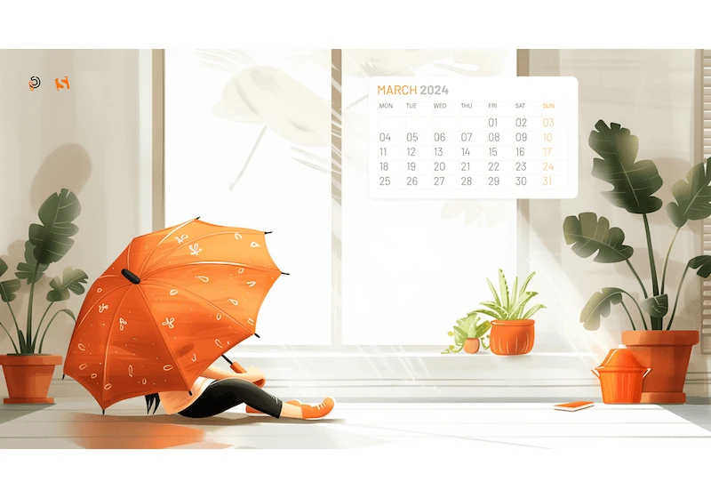
Do you need a little inspiration boost? Well, then our new batch of desktop wallpapers is for you. Designed by artists and designers from across the globe, they come in versions with and without a calendar for March 2024. Enjoy! https://smashingmagazine.com/2024/02/desktop-wallpaper-calendars-march-2024/
The Performance API is a set of standards for measuring and evaluating performance metrics with JavaScript. This article demonstrates how to use the Performance API to generate performance metrics directly in the DOM to create your own reporting. https://smashingmagazine.com/2024/02/reporting-core-web-vitals-performance-api/
Digital designer Yichan Wang has put together this collection of strategies and selling points to help you encourage and advocate for accessibility in your place of work, including useful scripts you can use as starting points. https://smashingmagazine.com/2024/02/web-designer-accessibility-advocacy-toolkit/

It’s well-established that the web faces wide-ranging usability and performance issues, from user-hostile UI patterns and twisted search results to sluggish performance and battery-draining bloat. In this article, Frederik examines one small-but-significant aspect where developers take the reins: Painting pixels on the screen. https://smashingmagazine.com/2024/02/vanilla-javascript-libraries-quest-stateful-dom-rendering/
Understanding color accessibility is more than just ticking boxes. Even with good contrast, diverse color perception can make interfaces challenging for users. Check out practical guidelines for colorblindness to ensure more inclusive design. An upcoming part of Smart Interface Design Patterns. https://smashingmagazine.com/2024/02/designing-for-colorblindness/
Accessibility goes beyond making products user-friendly. It can significantly impact the quality of life for people with disabilities. Kate Kalcevich shares lessons she learned from assistive technology users — challenges and barriers they encounter on mobile devices. https://smashingmagazine.com/2024/02/mobile-accessibility-barriers-assistive-technology-users/
Accessibility for data visualization extends well beyond web standards, at least if you’re trying to create an experience that’s actually useful. This article focuses on techniques for creating useful and accessible visualizations that extend well beyond compliance. https://smashingmagazine.com/2024/02/accessibility-standards-empower-better-chart-visual-design/
How to design for children aged 3–12, with insights into user behavior, considerations for parents, and practical UX guidelines. https://smashingmagazine.com/2024/02/practical-guide-design-children/
A radar chart — also commonly called a spider chart — is yet another way to visualize data and make connections. Radar charts are inherently geometric, making them both a perfect fit and fun to make with CSS, thanks to the polygon() function. Read along as Preethi Sam demonstrates the process and sprinkles it with a pinch of JavaScript to make a handy, reusable component.
https://smashingmagazine.com/2024/02/draw-radar-charts-web/


